GPT Image 2.5
Two new image models, what each one is for, and how to describe the picture you actually want.
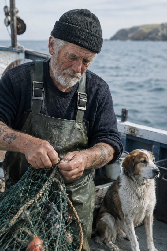
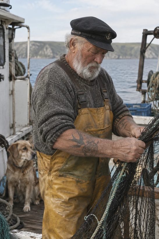
Same prompt, same settings, two different models. Every image in this guide comes from the official OpenAI guide.
Summary prepared 12 September 2026. All example images are from that page.
Part 1
Two models, one simple trade-off
GPT Image 2.5 comes in two flavours. They are not "old" and "new" — they are "fast" and "beautiful". That is the whole decision.
Built for speed
Image quality is roughly the same as the previous generation (GPT Image 2), but it answers faster.
- Bulk work — many images at once
- Drafts, previews, internal use
- When waiting is the problem, not looks
Built for quality
Noticeably better looking than the previous generation. Slower, and you should check the price rather than assume.
- Anything a client or the public sees
- Images with text, logos, fine detail
- Faces and products that must stay exact
Both models are better at two things
You can change one thing in a picture and leave everything else alone — swap a chair, remove an object, translate the text on a poster.
A person's face, a product's shape, a label's wording survive the edit instead of quietly drifting into someone or something else.
How to pick, in two sentences
| Your situation | Start with |
|---|---|
| What you already produce looks good enough | Flare. See whether you keep that quality and get your results faster. |
| What you already produce is not good enough | Sunburst. First confirm it hits the quality you need. Then retest the same prompts on Flare — if Flare also passes, switch to it for the speed. |
Two traps worth knowing. First: the same quality label does not mean the same result on both models — "high" on Flare is not "high" on Sunburst. Second: do not assume the faster model is the cheaper one. Check the current pricing before you commit.
Part 2
The three settings you actually touch
Everything else is words. These three are dials you set separately from your description.
1 · Quality — how much effort it puts in
Six levels: auto, low, medium, high, xhigh, max. Start where the picture looks right, then try stepping down to see if it still holds — a lower setting that still passes gives you the same picture, faster.
Use high when the image contains small text, dense labels, a chart, or a diagram. Reach for xhigh or max only when something is genuinely failing and you have the time to spare. A higher setting is not automatically a better picture.
2 · Size — the shape of the canvas
| Common choice | What it suits |
|---|---|
| 1024 × 1024 | Square — social posts, avatars, icons |
| 1024 × 1536 | Portrait — stories, reels, phone-first images |
| 1536 × 1024 | Landscape — slides, banners, wide diagrams |
| 2048 × 2048 / 3840 × 2160 | 2K and 4K — print and large screens |
If you type a custom size: no edge above 3,840 pixels, both edges divisible by 16, and the long edge no more than 3× the short edge. Anything above roughly 2560 × 1440 is still experimental.
3 · Background — solid or see-through
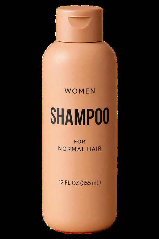
Set it to transparent when you want a cut-out — a logo or a product with no backdrop, ready to drop onto any colour. Save it as PNG or WebP, never JPEG, or the transparency is lost.
How to tell real transparency from fake. If the model paints a grey-and-white chequerboard into the picture, that is a drawing of transparency, not transparency. A real cut-out shows your own background through it when you place it. Check the edges — hair, glass, shadows — that is where it goes wrong.

Part 3
How to describe what you want
Eight habits that separate a usable image from a lucky one. None of them require technical language — they require being specific.
Say what the finished thing is
Name the deliverable and its purpose — a product photograph, a magazine advertisement, a classroom diagram — then the composition, the proportions, and anything that must sit in a particular place. For complicated requests, write it in labelled blocks: scene, subject, details, constraints.
A nice picture of a kitchen
A real-estate listing photograph of a kitchen, shot from the doorway, portrait format, island centred, window on the right
Write it in whatever form you can maintain
Short sentences, a flowing paragraph, a bulleted list, labelled sections — they all work equally well. There is no magic syntax to learn. Choose the layout you will still understand when you come back to edit it next month.
Describe what is visible, not the mood
Name materials, lighting, colours, and the medium. If you want it to look like a real photograph, say "photorealistic" or "a real photograph" — do not assume. Camera terms such as "50mm lens" are hints about the look, not physics. For wide, moody, night-time or rainy scenes, describe the scale, the atmosphere and the colours instead of leaning on one mood word.
Make it cinematic and dramatic
Soft coastal daylight, shallow depth of field, subtle film grain, natural colour, worn materials, real skin texture, no heavy retouching
Be explicit about people and what they are doing
Say how much of the body is in frame, how big the person is in the picture, where they are looking, and how they are touching the objects around them. Phrases like "full body visible, feet included", "looking down at the open book", or "hands naturally gripping the handlebars" are what turns a stiff pose into a real one.
Put required wording in quotation marks
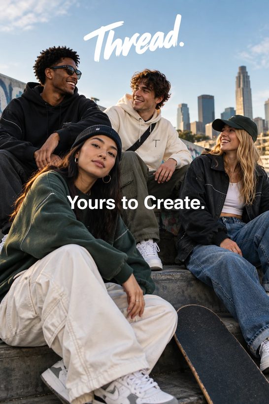
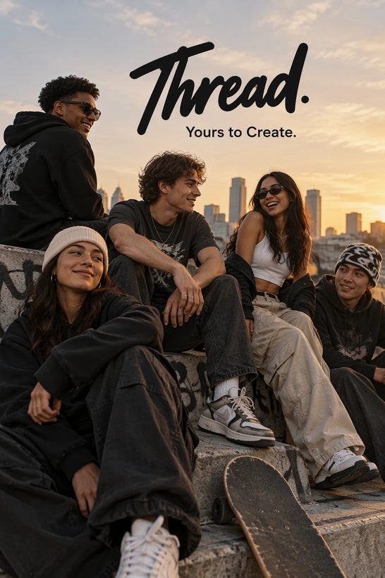
Write the exact words you need in quotes, say where they go and how they should look, and state how many times they should appear. Spell out unusual names letter by letter. Add "no extra text" — then read the result and check the spelling yourself. Compare medium and high quality when the text is small or there are several fonts.
Add the brand tagline somewhere on the ad
Render the tagline "Yours to Create" exactly once, legibly, integrated into the layout. No extra text, no watermarks, no other logos.
Separate what changes from what must not
When editing an existing image, say "change only X" and then list everything that has to survive — the face, the proportions, the layout, the lighting, the labels. Also say what must not appear: no added text, no logos, no watermarks. For small local edits, name the surrounding things too: the camera angle, the contrast, the objects nearby.
Make the chairs wooden
Replace ONLY the white chairs with wooden ones. Keep the camera angle, room lighting, floor shadows and every surrounding object unchanged.
Give every reference image a job
When you supply more than one picture, number them and say what each one is for — this is the subject, this is the style, this is the clothing, this is the background. Then explain how they combine and which piece moves where.
Place the dog from image 2 into the setting of image 1, right next to the woman. Match the lighting, composition and background of image 1. Change nothing else.
Change one thing at a time
Feed the previous result back in as the starting point, ask for a single change, and repeat the things that must stay. "Same style as before" often carries, but if the picture starts drifting, restate the important constraints in full. Compare results before piling on more instructions.
Worth knowing. Repeated rounds of editing can still nudge details you meant to protect. If one area has to stay pixel-for-pixel identical, do not rely on words — paste the approved edit back over the original in any image editor.
Part 4
What it can make from scratch
Nine jobs the official guide walks through. Every image below is Sunburst output.
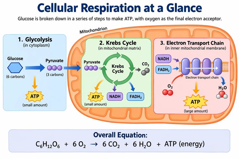
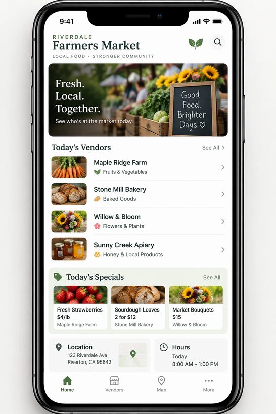
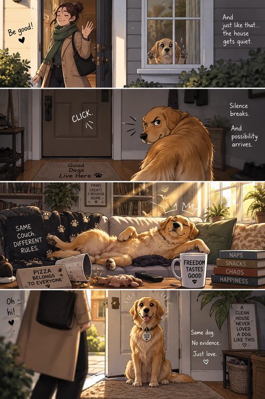
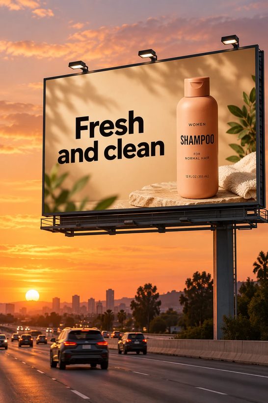
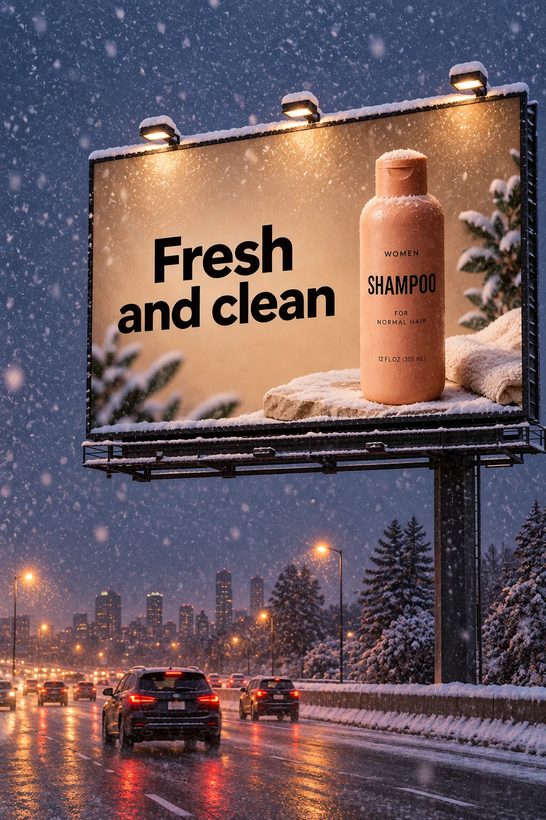
A word on diagrams and charts. Good looks are not the same as correct. When the image carries facts — labels, arrows, figures, relationships — read them as carefully as you would proofread a document. The model will happily produce a beautiful diagram that says the wrong thing.
Part 5
Editing a picture you already have
This is where the new models improved most: changing one thing while everything else stays put.
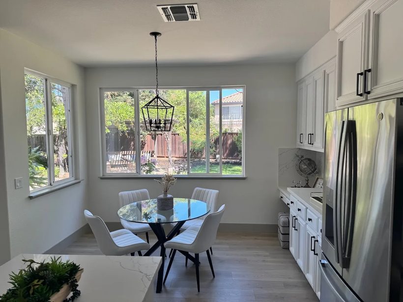
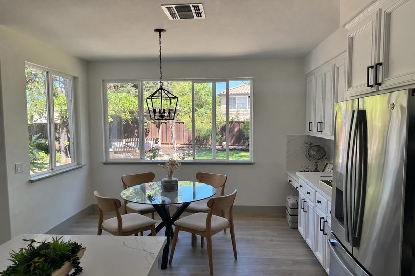
Swap an object, keep the room
"Replace ONLY the white chairs with wooden chairs. Preserve the camera angle, lighting, floor shadows and surrounding objects."
Original photo
After the edit
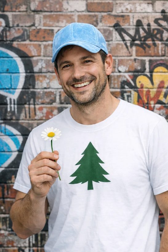
Remove something, disturb nothing
"Remove the flower from the man's hand. Do not change anything else."
Original photo
After the edit

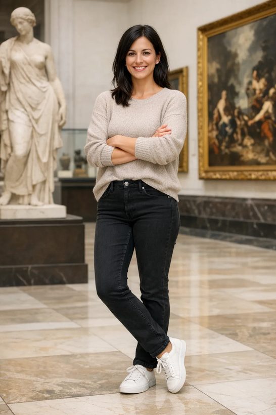
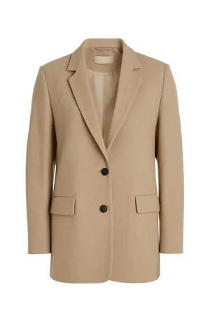
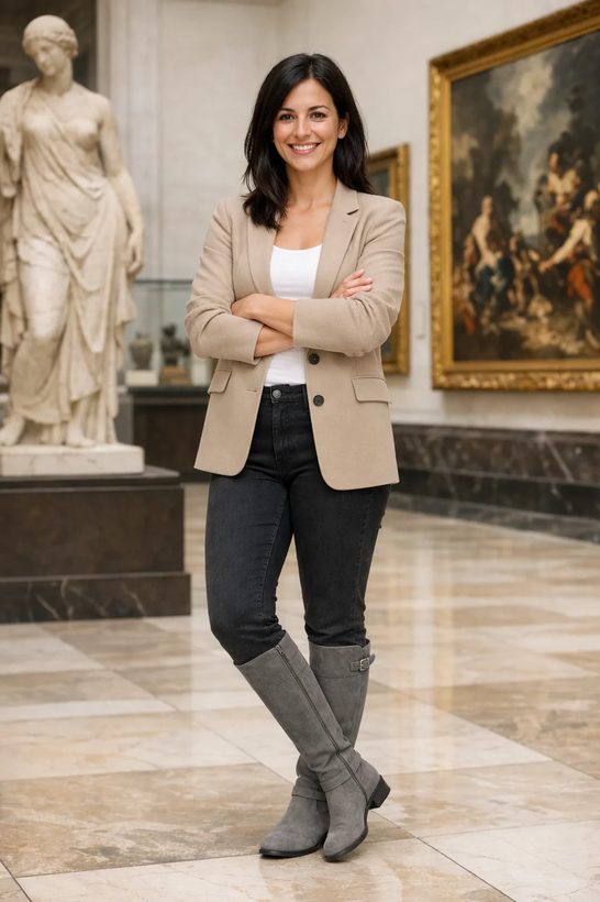
Change the clothes, keep the person
"Dress the woman using the provided clothing images. Do not change her face, skin tone, body shape, pose or identity. Replace only the clothing, with realistic fabric behaviour and matching light."
Person
Garment
Result
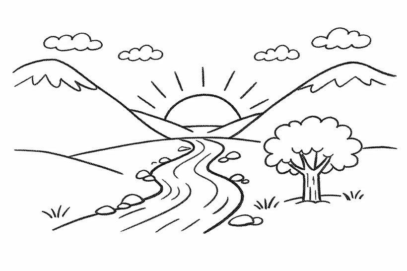
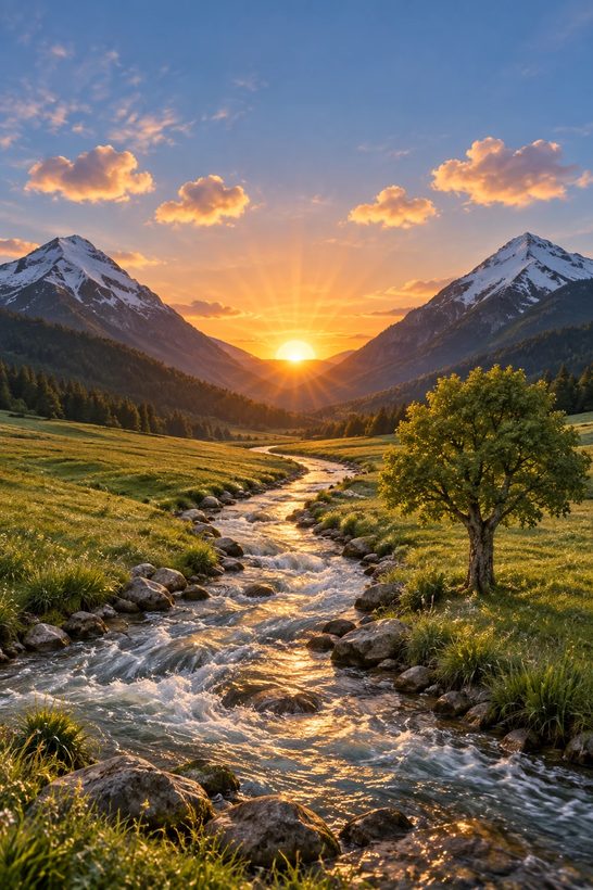
Turn a rough sketch into a real photograph
"Preserve the exact layout, proportions and perspective. Choose realistic materials and lighting. Do not add new elements or text."
Hand drawing
Photorealistic version
Lift a product off its background
"Isolate the product on a fully transparent background. Crisp silhouette, no halos. Preserve the geometry and keep the label readable. No backdrop, no chequerboard, no shadow."
Original photo
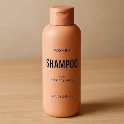
Transparent cut-out
Other edits the guide covers
Change only the words into another language and keep the design untouched — then check for anything left in the original language.
Hand over one image purely as a style reference, then describe a completely different subject to be drawn that way.
Build one reference image of the character, then reuse it for every new scene while repeating their defining features — the way you would illustrate a picture book.
Part 6
Before you use the image
Four checks. They take thirty seconds and catch almost everything that goes wrong.
- Read every word in the picture. Is the required text spelled correctly and easy to read? On a diagram, are the labels right and pointing at the right things?
- Check that nothing drifted. Is it still the same face, the same product shape, the same label wording you started with?
- Confirm it changed only what you asked for. Anything else that moved is a mistake, even a flattering one.
- If you needed transparency, open the file and look. A real cut-out has a genuinely empty background — not a chequerboard pattern painted into the image.
Four things to remember
Specific beats poetic
Describing what is physically visible — materials, light, framing, exact words — works better than describing how the picture should feel.
One change per round
Feed the result back in and adjust a single thing. Stacking five instructions makes it impossible to tell which one helped.
Test on your own work
Speed, quality and cost all depend on your prompts, your reference images and your output size. Someone else's comparison does not predict yours.
Roll out slowly
When you switch models, move a small share of your work first, watch the same measures, and keep the old model available to fall back to.
It includes the complete prompts behind every image in this summary, side-by-side Flare and Sunburst outputs for each one, and the full list of settings.
Prompts are one half. Video is the other.
PostAI turns one listing and one photo of you into a finished property video in about 60 seconds — no filming, no prompt writing.
Try PostAI free →GPT Image 2.5 — A Plain-English Guide · Summarised from the OpenAI image prompting guide, 12 September 2026 · All example images © OpenAI, shown here for reference.